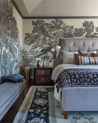
No question, the colors chosen for a room make a huge impact on the overall vibe of a space. Whether you prefer a space to be light, bright and airy or dark and moody can depend on the function of the room, personal preferences and the natural light of the room. The color choices impact every surface and every feature - the walls, ceiling, trim, doors, furnishings and accessories.
Asking both Rachel and Bryn for their perspectives on color choices in a room, here are their thoughts:
Rachel - I think more than having a light or dark room definitively, I crave contrast and energy in color combinations. So a light or neutral room is fine with me as long as there is a lot of texture and depth with darker accents thrown in. No surprise here though - I’m happier in a colorful room and continue to come across color combos in random places that are inspiring.
Bryn - The type of color I choose for a room often involves determining what the room “wants” and going with it. For example, a room with low or poor natural light wants to be dark. In that instance I try to embrace that element with a darker and moodier color rather than fight it with a light and airy color.
Additionally, my personal philosophy is that every home should have one saturated room of color. This is a room to retreat to that feels cozy and like its wrapping you up. It might be a family room for watching TV or a dining room that begs you to sit and stay a little longer.
Digging into this thought with an example, let’s look at this primary bedroom.
While all of the custom details in this bedroom are dramatic and grab the eye, the unsung hero of this sophisticated space is the paint color. With the tonal and neutral mural and fabrics in place, we landed on a saturated color for the doors, baseboard and millwork in the room - Sherwin William’s Urbane Bronze. This chameleon color is a bit black, a bit brown and even has a slight green undertone. It has enough energy to it that it doesn’t suck up all the light and feels warm as opposed to a starker true-black. A lighter trim color in this room would have contrasted too much with all the subtle neutrals and the vibe would have changed completely. Case in point for leaning into and committing to the palette of a room and not just going to the default option of white.
To view more of this primary bedroom and other rooms in this home, visit our PORTFOLIO.


