People often ask what kind of clients we help at Two Hands Interiors. Residential? Commercial? We actually help both. The Two Hands team loves the mix of having both residential and commercial clients because each have their unique traits and design goals. Whereas a client’s residence is very personal, sentimental, and evokes more emotions, commercial spaces tend to be hard-working, functional, and an opportunity to “go for it” because you are using the design to bring to life an experience or a brand. Our team is always thrilled to work on a restaurant (BLACKBERRY MARKET), a bar (SUBOURBAN), or an office like the opportunity we had to design the International Carwash Association’s (ICA) new corporate headquarters.
Blackbery Market
Subourbon Whisky Bar
International Carwash Association Headquarters
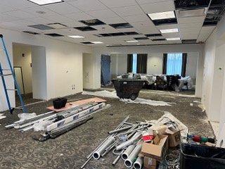
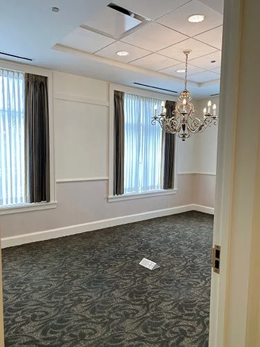
Located in the heart of Maybury-esque downtown Wheaton, the ICA headquarters was a build-out in an old bank building. The building began as traditional and serious as they come with ornate chandeliers, intricate millwork details and a huge board room with coordinating mahogany wall cladding and boardroom table for 20. Our clients at ICA loved the location but wanted a more youthful, fun and definitely less serious aesthetic. One of the design requests used by ICA CEO, Eric Wulf, was “Googie”, meaning design reminiscent of futurist architecture from the midcentury (common architecture during the rise of popularity of stand-alone carwashes.) Mahogany clad walls evolving to futurist/atomic age is quite an ask — especially while trying to stay in budget on a complete remodel.
The first stage of the project was to re-think the layout of the office. Instead of many closed-off rooms with very little natural light, the new layout hoped to facilitate a more communal and collaborative atmosphere as well as let in as much natural light as possible. The board room received a glass wall and portions of walls were taken out to add more sight lines across the space. Rooms that once housed massive IT systems became additional offices or meeting spaces.
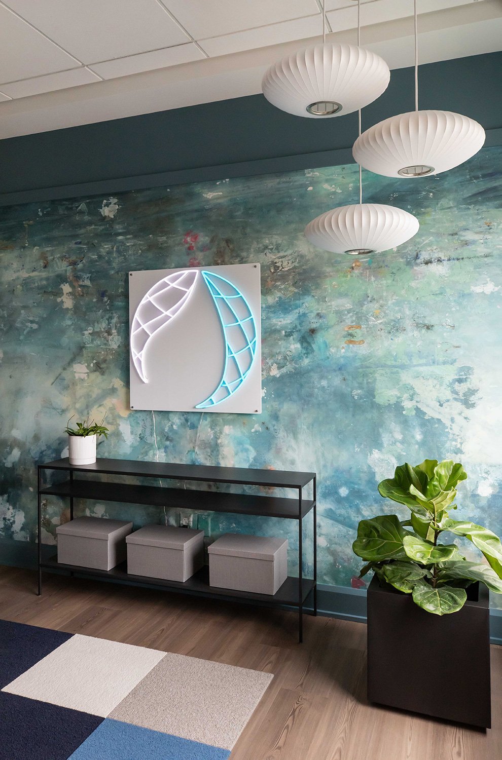
After addressing flow, light and usage needs, we came up with our palette. In many of our designs we often turn to art for inspiration. In this project we started with a beautiful encaustic piece by a favorite artist, MARISSA VOYTENKO. This piece is called “Come Together” from her Boats collection. We used the painting along with ICA’s branding colors to develop the rest of the design scheme. Blending standard construction finishes (paint, flooring and carpet) with colorful enameled midcentury ceiling and wall sconces, funky cork and metallic wallpaper and additional art (another painting and vintage carwash photography) we had our overall design.
The final layer in the space was adding the company mission statement and philosophy in an artful and modern way as well as filling the space with an abundance of greenery throughout —now that the space has such amazing natural light. The end result exceeded all of our expectations (and thankfully our client’s too!)
Take a tour of this new Wheaton corporate headquarters here:


