One of my favorite things about our business is when we get invited back to our clients’ homes for ongoing work. We’ve been working with some of our clients for the better part of ten years - and we consider it a huge privilege that they call us back when their needs or wants for their homes change. This project reveal is a great example of that - having already tackled a kitchen, living and dining room refresh several years ago, it was time for the dated wet bar and office to be addressed.
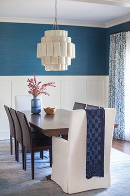
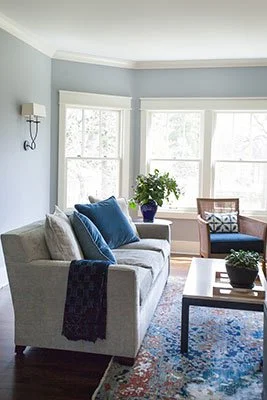
With updates from years past, we were excited to draw some design connections between previously updated and soon-to-be updated spaces.
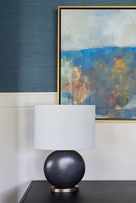
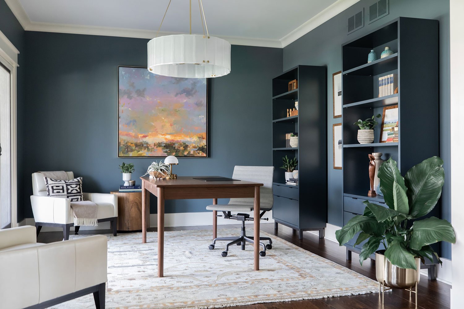
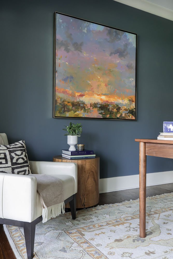
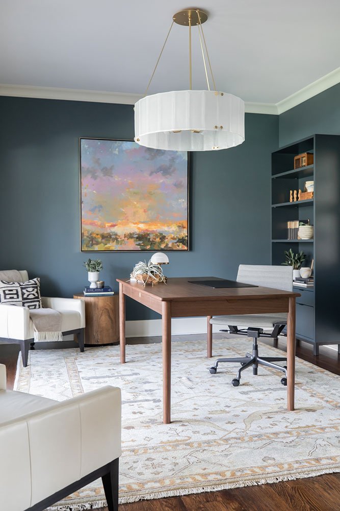
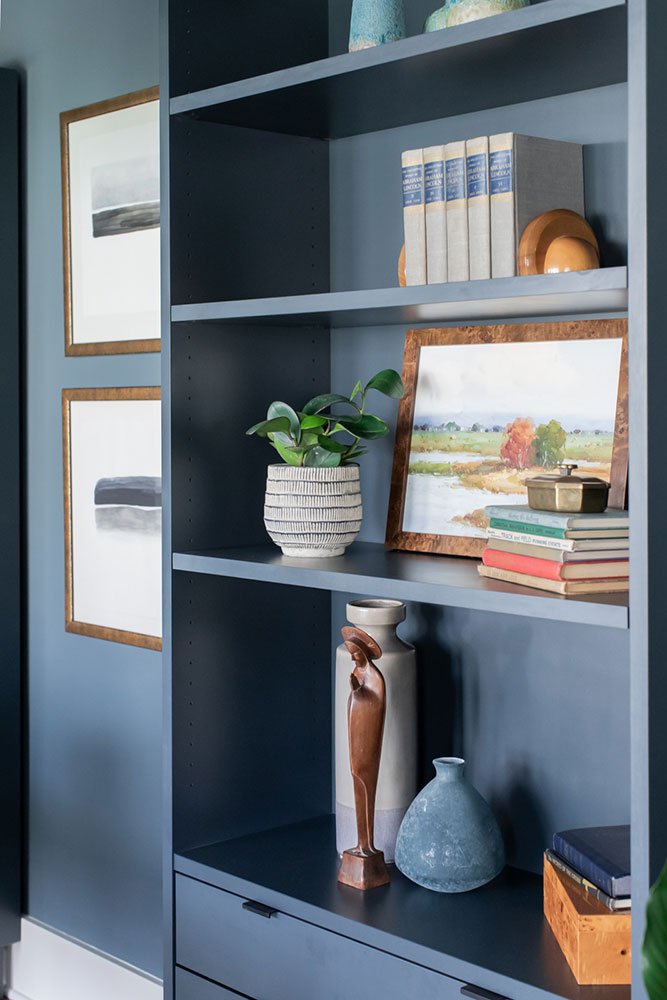
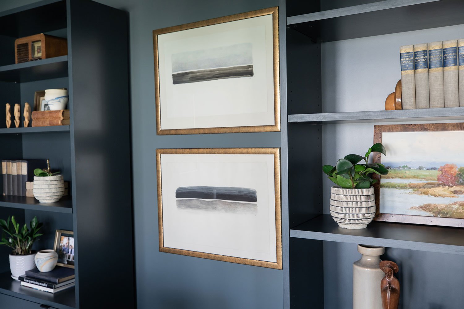
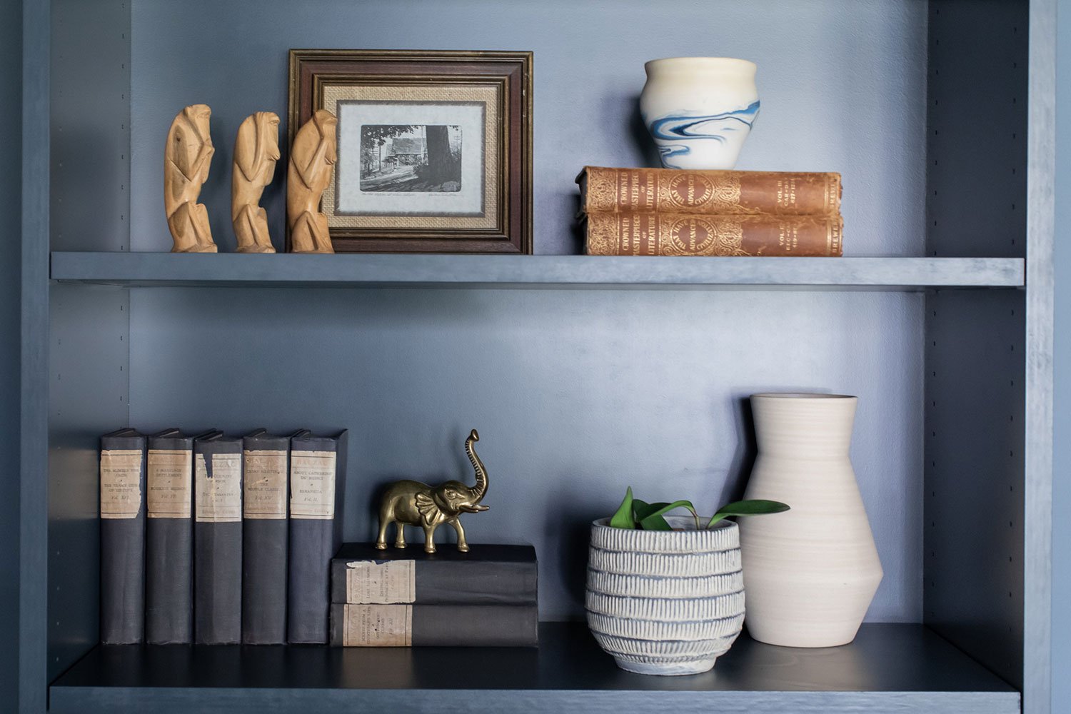
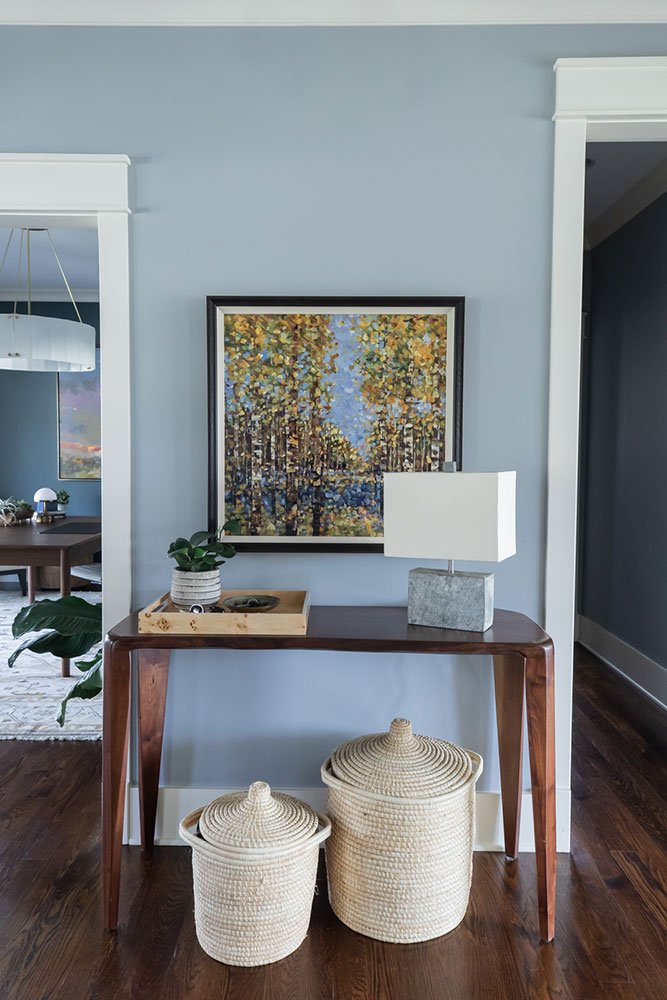
With a decorative (read non-functional) fireplace and mis-matched furniture, the office was aesthetically neglected even though its sits at the home’s front entry and actually got a lot of use by the family. Starting by removing the faux fireplace, this was a simple refresh of paint, lighting and fresh, functional furniture. Repeating the rich blue from the opposite dining room made for a rich but neutral palette. Working in a beautiful natural wood desk and slim lined shelving, the real star of the show is the fabulous artwork. Large in scale and almost arresting, it grabs your eye upon entering the home and delivers major personality.
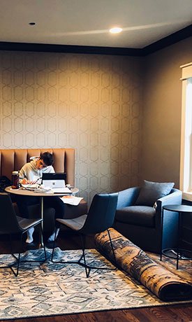
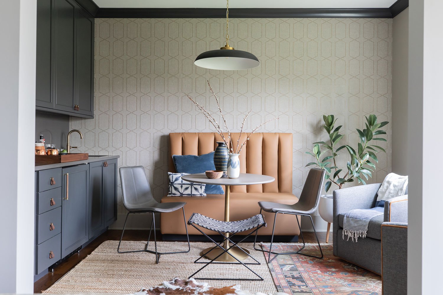
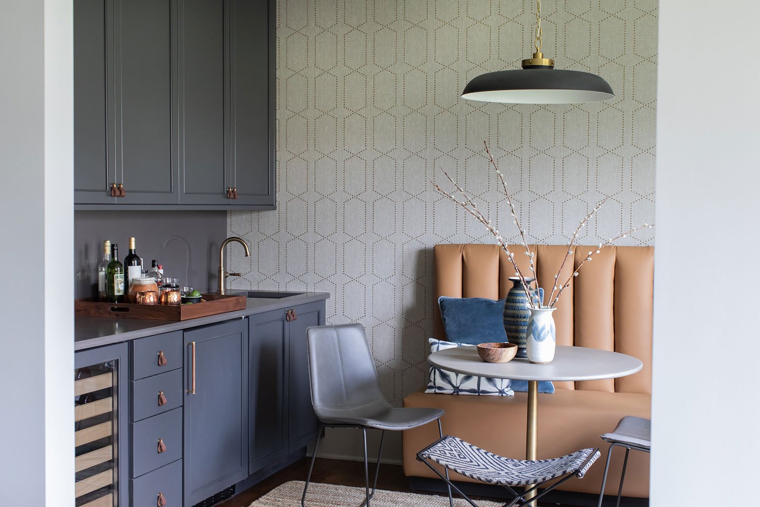
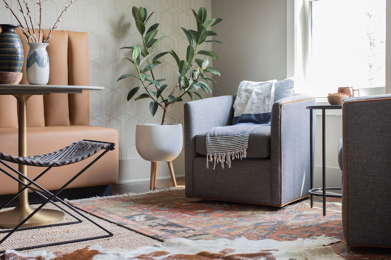
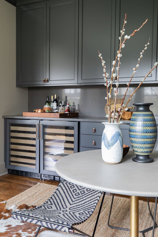
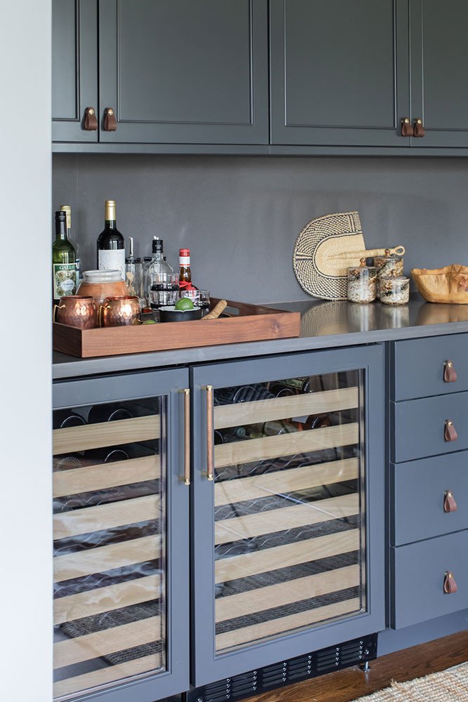
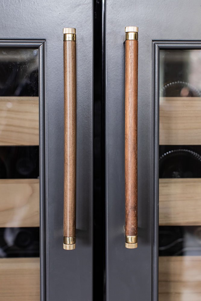
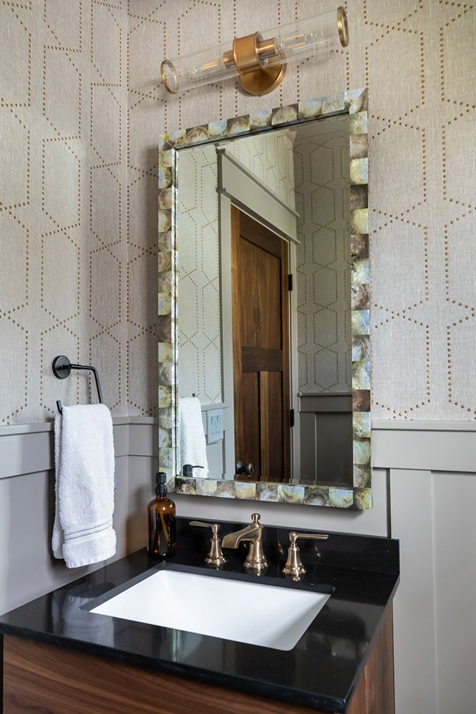
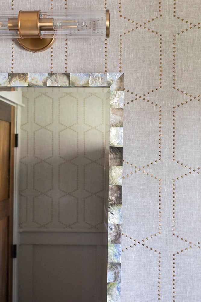
Moving to the back of the home, the existing wet bar was rarely used with it’s over-scaled cabinetry layout that required the host to stand at attention behind the bar instead of inviting guests to self-serve - which is more common in our current casual entertaining trends. Further, mom and dad wished for the space to have more function and appeal than just a bar. The goal was to redefine the space with comfortable seating and a table for games and homework, while still being a great spot to grab a cocktail. A custom banquette is the feature now, with a cozy table and flexible stools that serve everyday life as well as special parties. The bar is tucked away to the side - with tons of storage, two beverages fridges and loads of counter space for when entertaining is in full swing. Meanwhile, a cozy grouping of chairs is perfect for lounging. All these changes are set against the stunning riveted grasscloth wallpaper which both draws the eye but isn’t so flashy that it doesn’t fit with the rest of the first floor. The powder room got a quick upgrade as well with a repeat of the game room wallpaper, an updated paint palette and rich walnut vanity with a special mirror.
The best feedback we could get was a quickly texted photo from our client showing the game room in action - iPads out for homework and the family pup snuggled up close by. We are grateful for every time we get invited back.
Here is a full tour of the new room updates:
To see updates in other areas of the home, visit this PAGE.
