HOW A GEORGIAN HOME RETAINED CHARM WHILE IMPROVING FLOW AND FINISHES
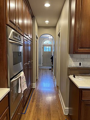
Clients often come to us with kitchens or baths that are "good enough" in regards to finishes or age and wear and tear - but they just weren't designed well for the space they inhabit. For example, dividing walls, tight spaces without enough clearance, a peninsula that doesn't fit the whole family, etc. Such was the case with this first floor renovation of a classic Chicago Georgian in Glen Ellyn. The family was after a kitchen that had better flow for daily use and holiday entertaining. The entry to the home, though charming with arches and original details, always felt cramped and didn't accommodate the jackets, backpacks and shoes that come and go - on repeat. So, the first order of business was to do some exploratory space planning - could we retain charm and original architectural details but still get a modern living space? The answer is yes!
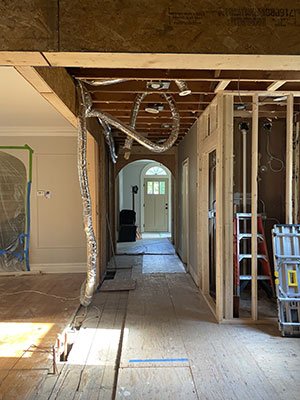
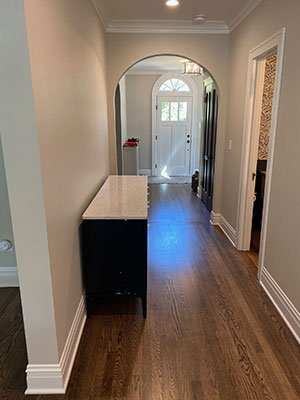
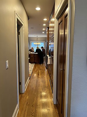
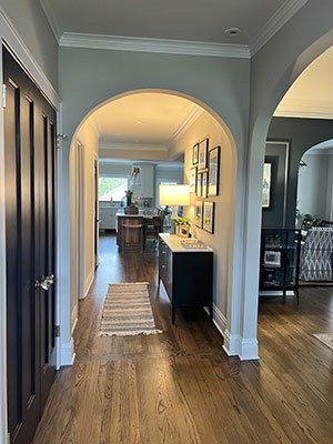
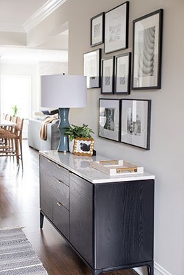
In the entry, removing a pass through vestibule wall cleared up site lines to the back of the house and gave some breathing room. While the space isn't technically bigger, the site lines and wider openings feel airy and less constrictive. As with many vintage homes, radiator heat is a thing - so, we designed a custom cover with a beautiful walnut hinge top so they can still access that awesome heat to dry gloves and snow gear. Getting functional updates and pretty touches in the entryway while retaining the home's character is a win.
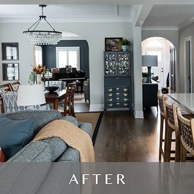
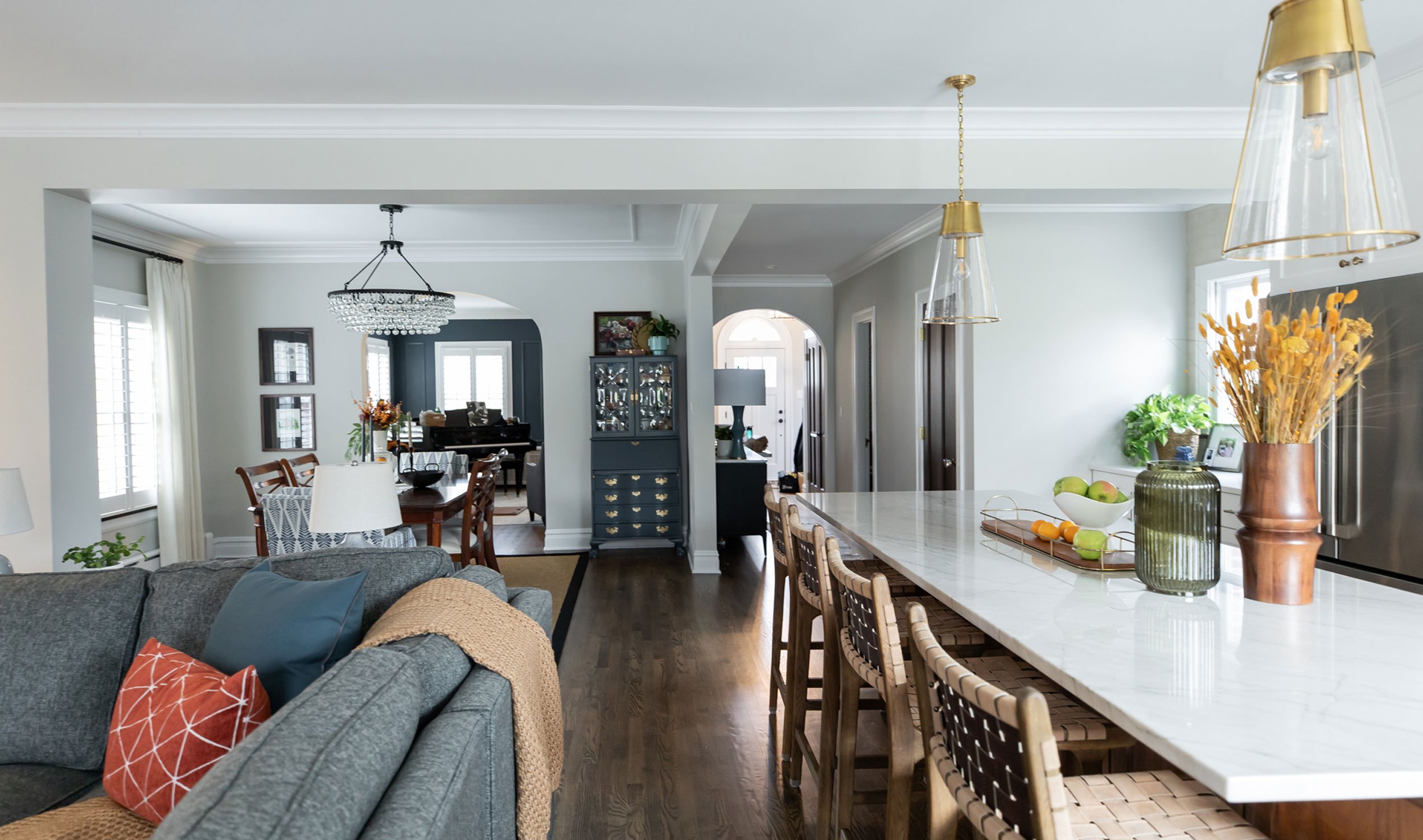
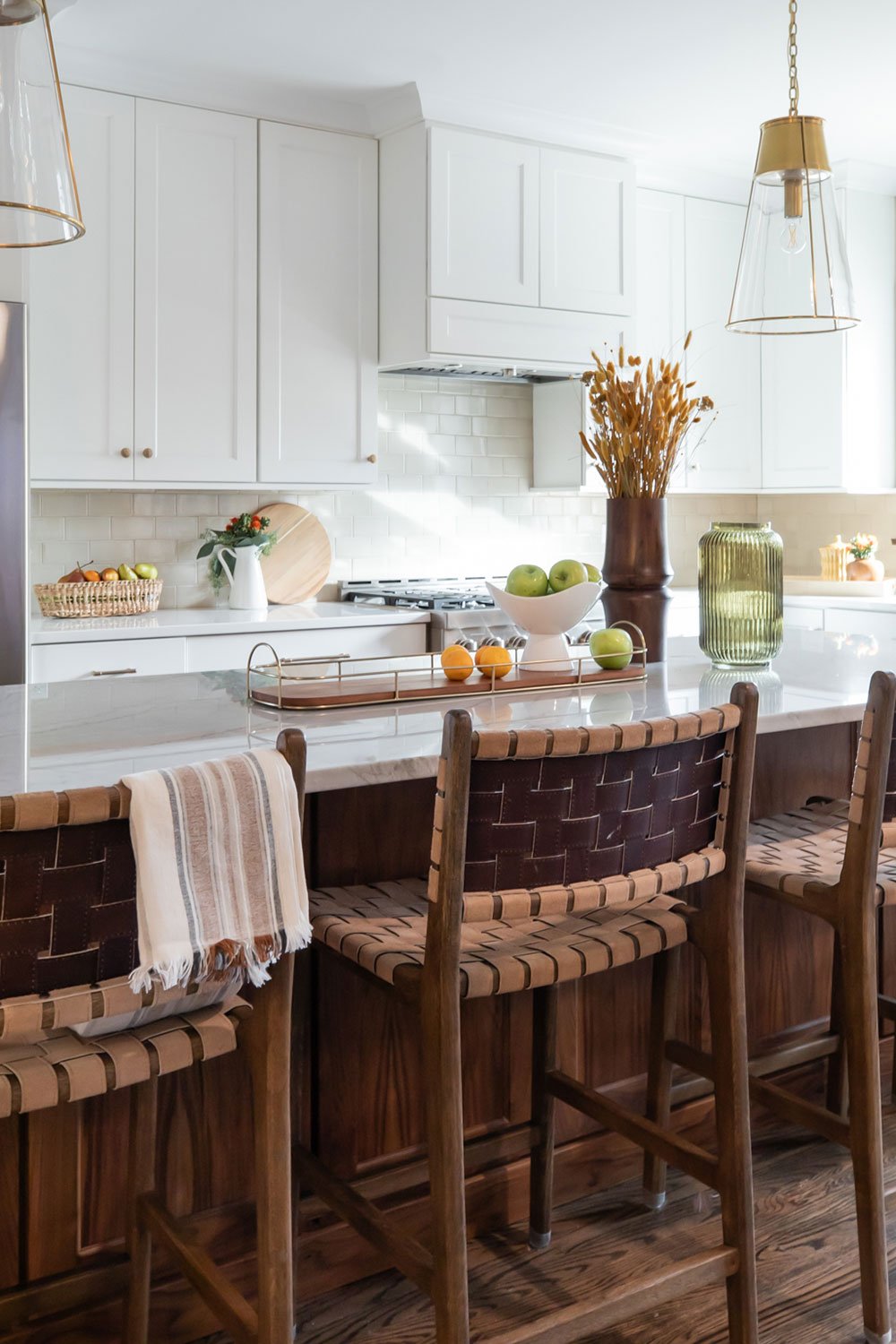
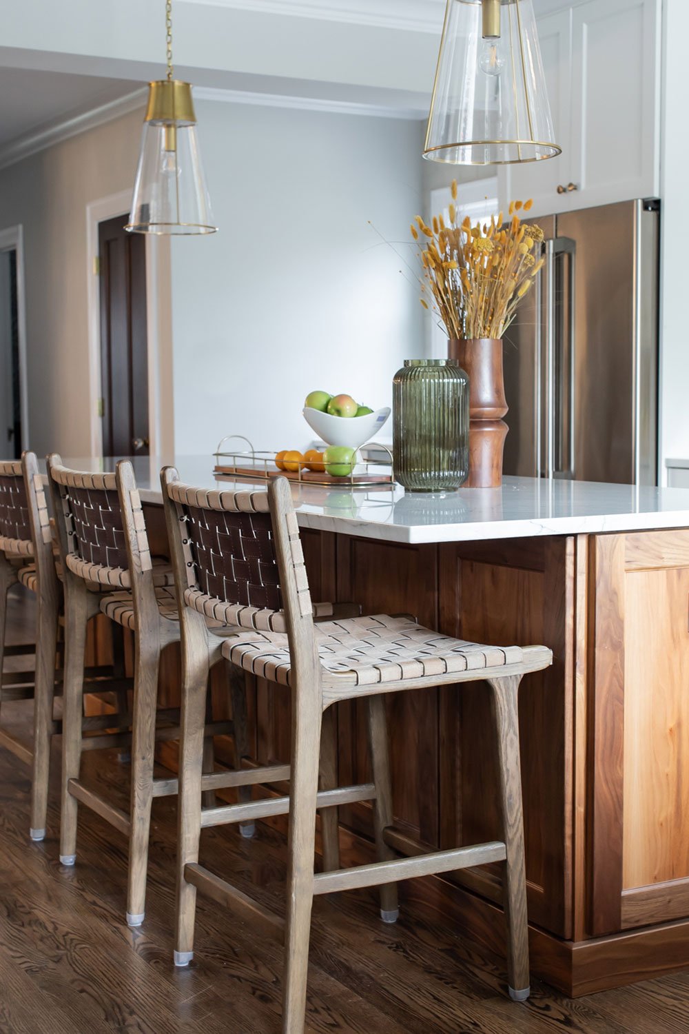
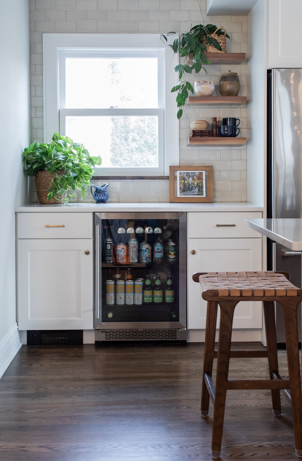
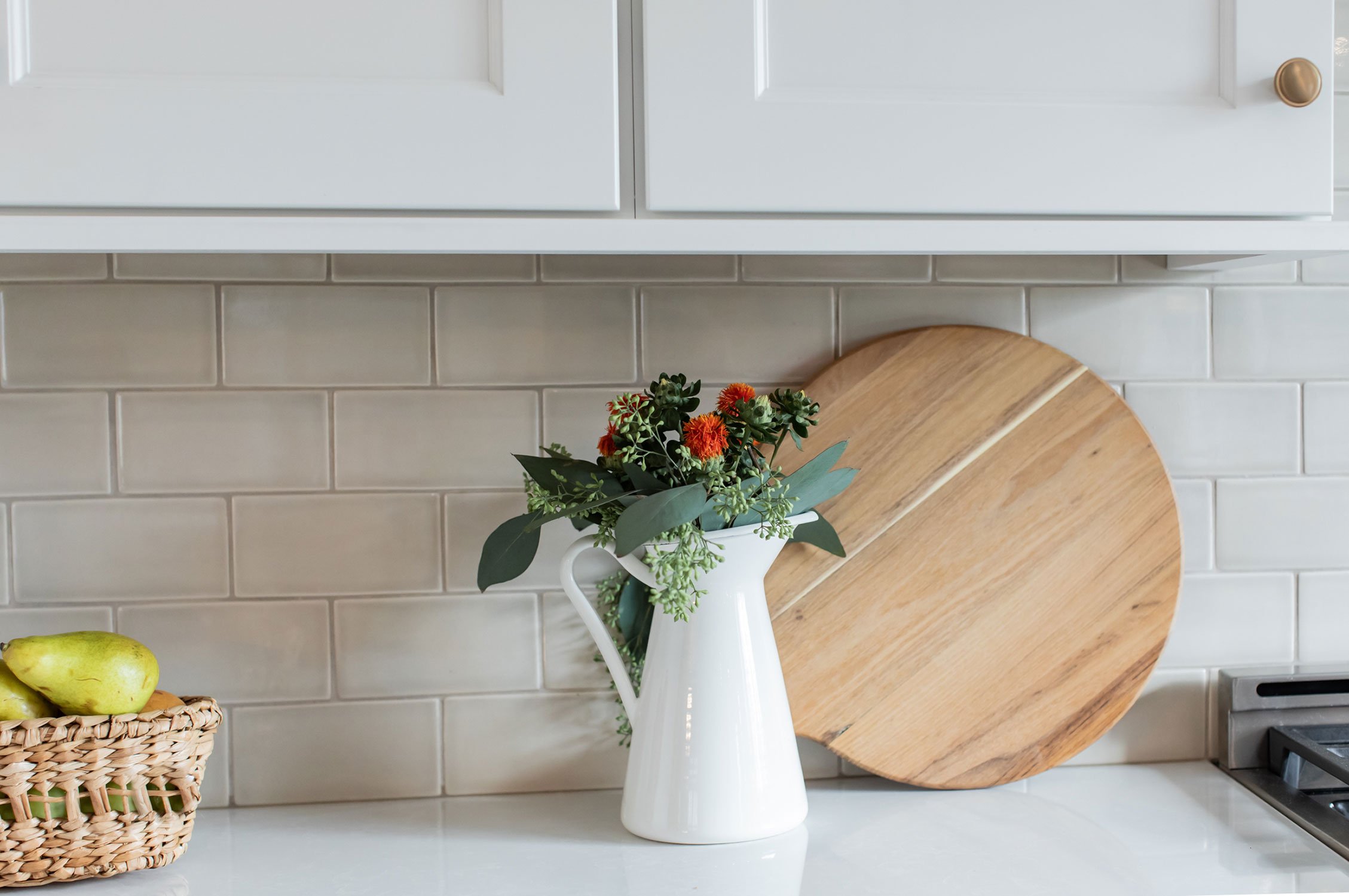
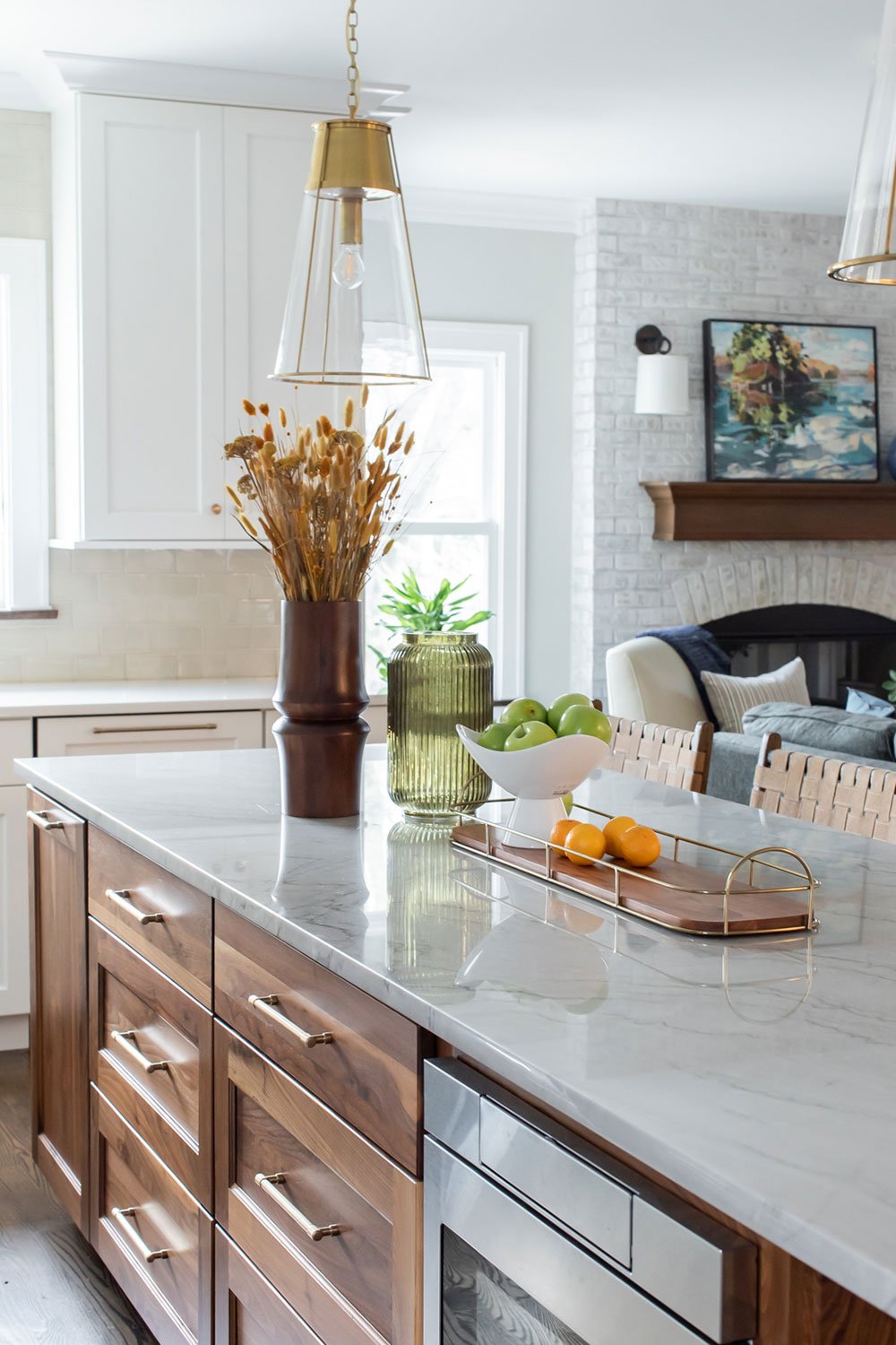
The renovated kitchen is centered on a generously sized island in a rich, warm walnut. Ample seating, prep space and storage is topped with a quartzite stone with just the right amount of interest and movement. The perimeter cabinets are a warm white with a soft, artisan backsplash in a just barely there neutral. Enlarged windows give lots of light, and a beverage center tucked away is the perfect spot for coffee, beverages for entertaining and custom walnut shelves.
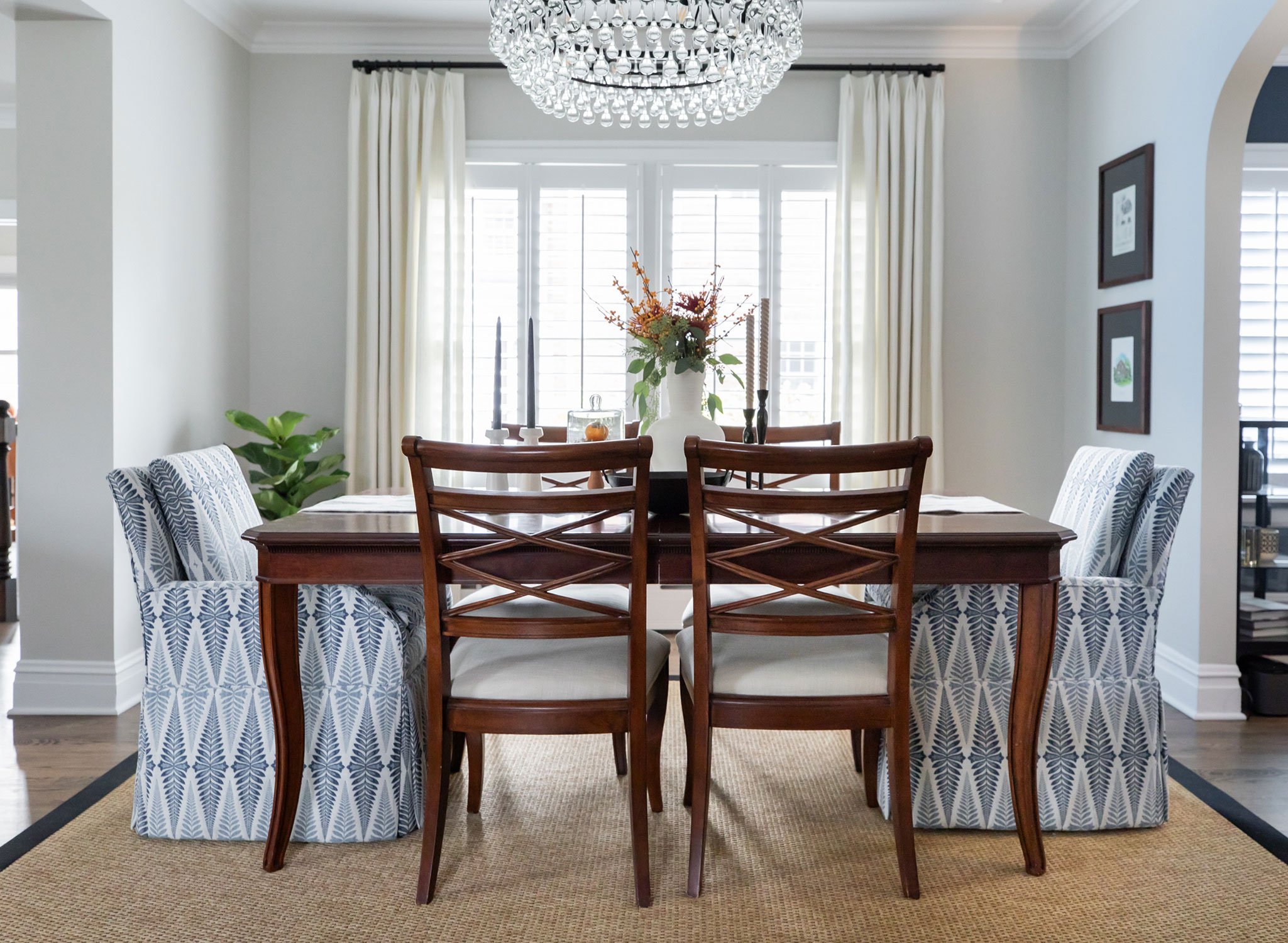
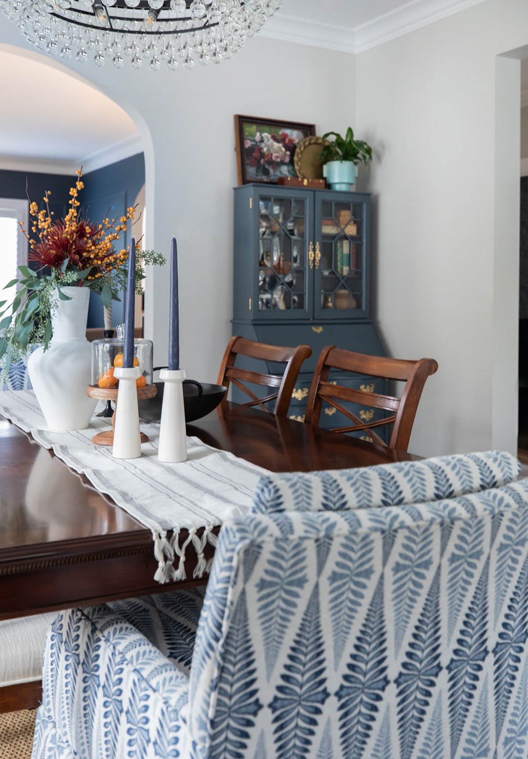
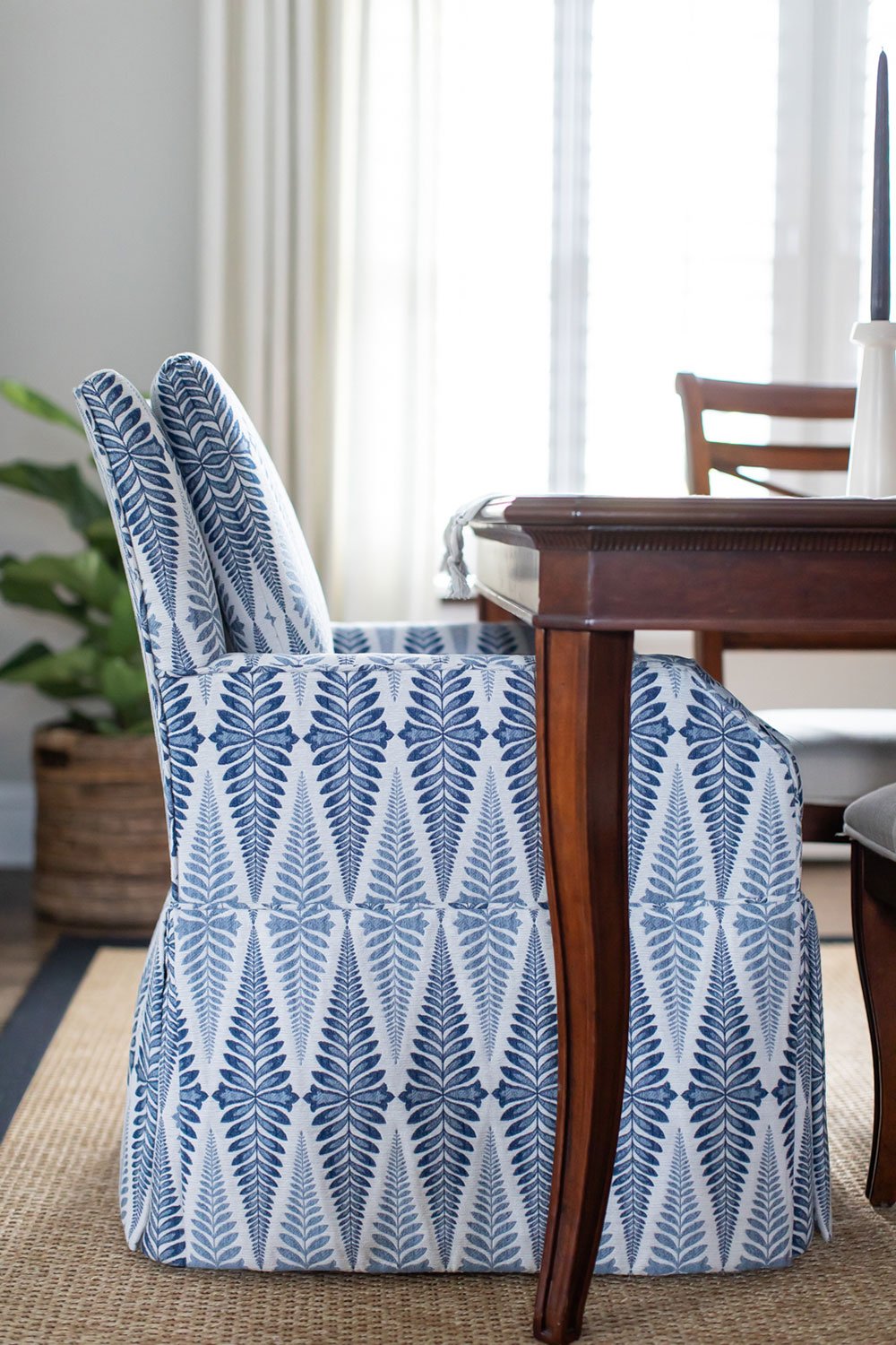
The family room fireplace was part of a previous addition and didn't have much character to retain. White-washed brick and a walnut mantel create a new neutral focal point. The dining room did not change size or foot print but the dividing wall between the kitchen was removed. The addition of ceiling molding, custom drapery and host and hostess chairs allowed the family to keep original elements but with a fresh feel and spaciousness.
All in all, this family gained a vastly improved flow and openness to their vintage home without losing the warmth and character - a win all around.
Take a full tour here:
Head to our KITCHENS for more kitchen renovation inspiration.


