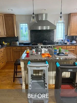
When undertaking a major renovation for an an active family, the combination of a good design and construction team can have a lasting impact. The time and cost associated with tearing up an occupied home means the final outcome needs to be rewarding enough to make it all worth it. Such was the case for this first and second floor renovation on the north side of Wheaton. A non-functional double height entry, cramped kitchen with an unused butler's pantry, and chopped up spaces were just not working for this family. Additionally, the upstairs family bathroom was used by both grandma and the kiddos - a better layout accommodating their various ages and needs was important. The design brief was simple - lighter and brighter with improved flow and storage everywhere.
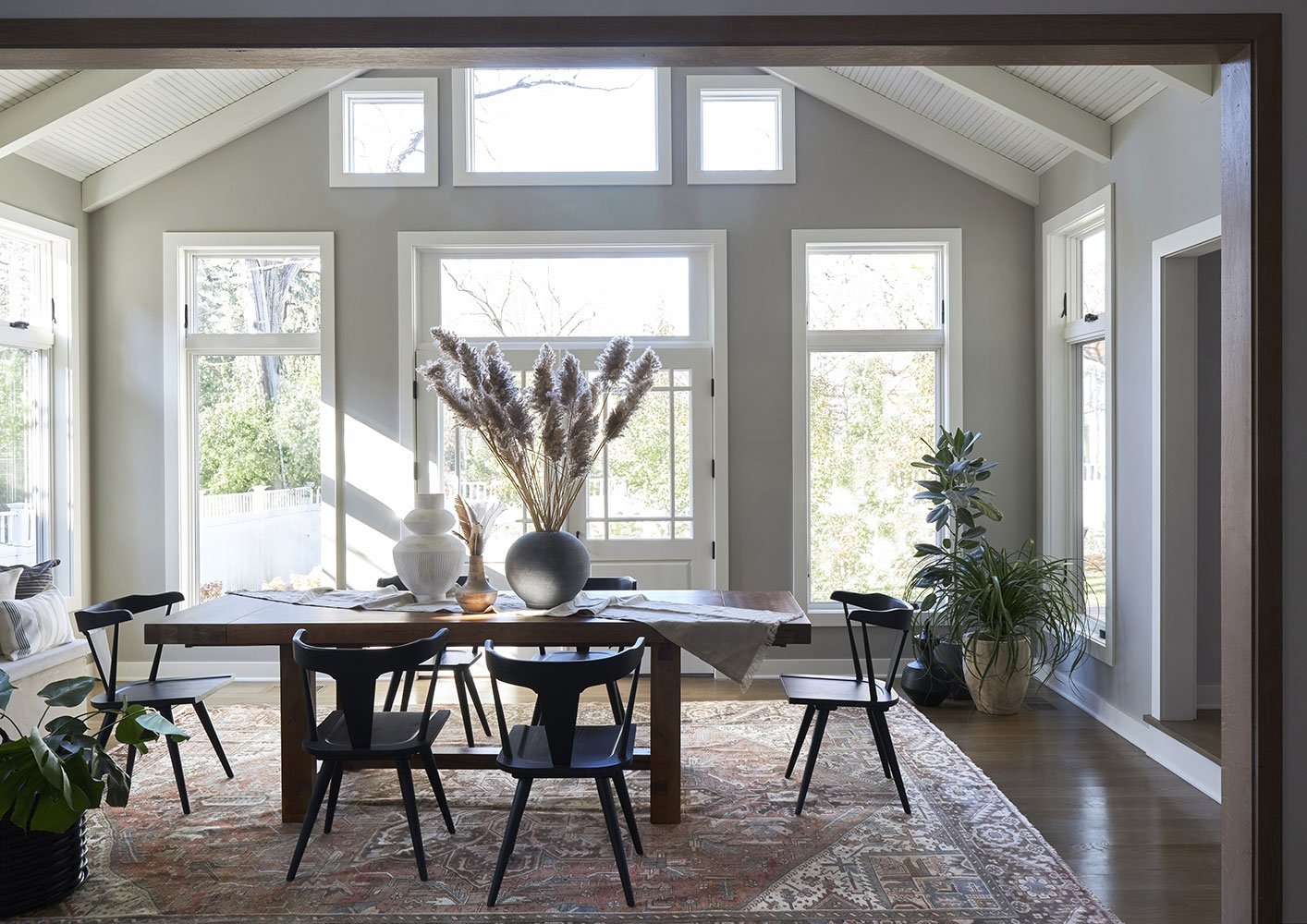
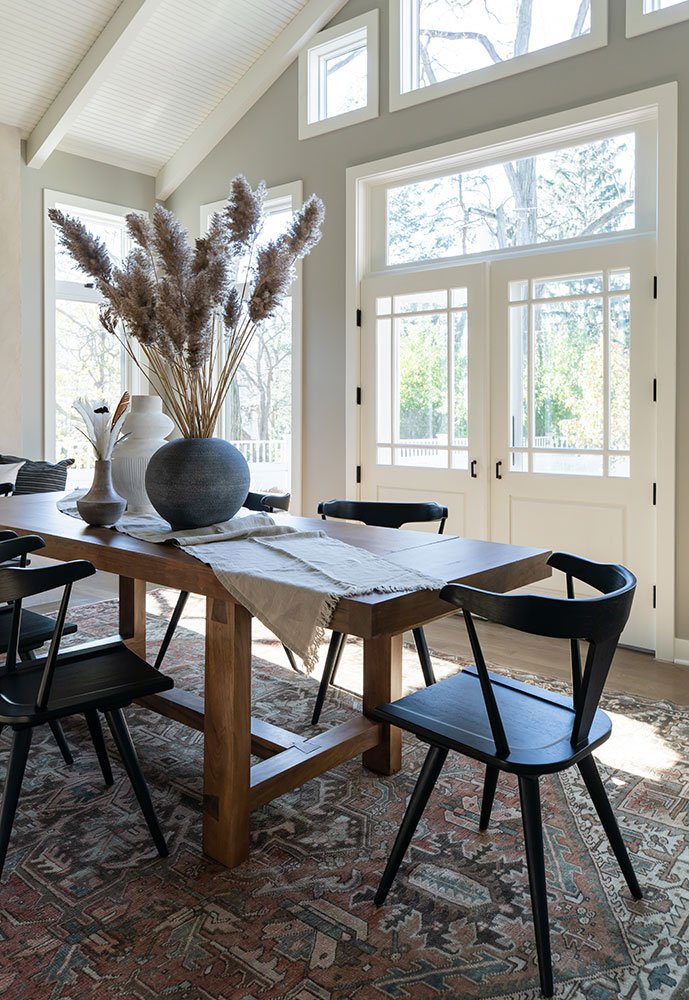
Adjusting the layout of the first floor came first. A ceiling was added to the entry to clean up sight lines and add square footage upstairs and a large set of walk-in closets were transformed to function like a mudroom. A more recent addition to the back of the house was a sunroom - but it was completely closed off from the kitchen and family room with doors on two walls. Removing the doors in favor of cased openings flooded the interior of the house with light and created visual connection and flow between all three spaces.
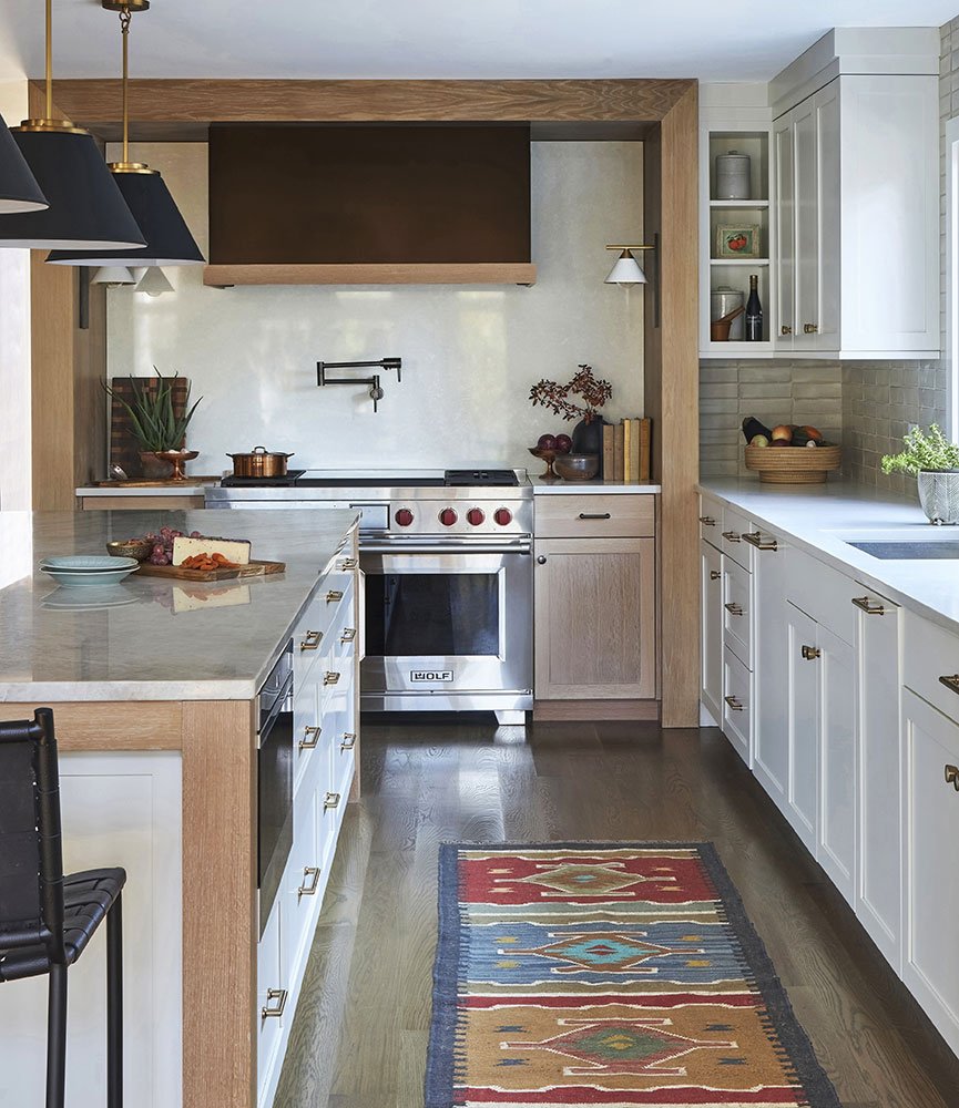
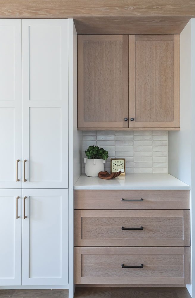
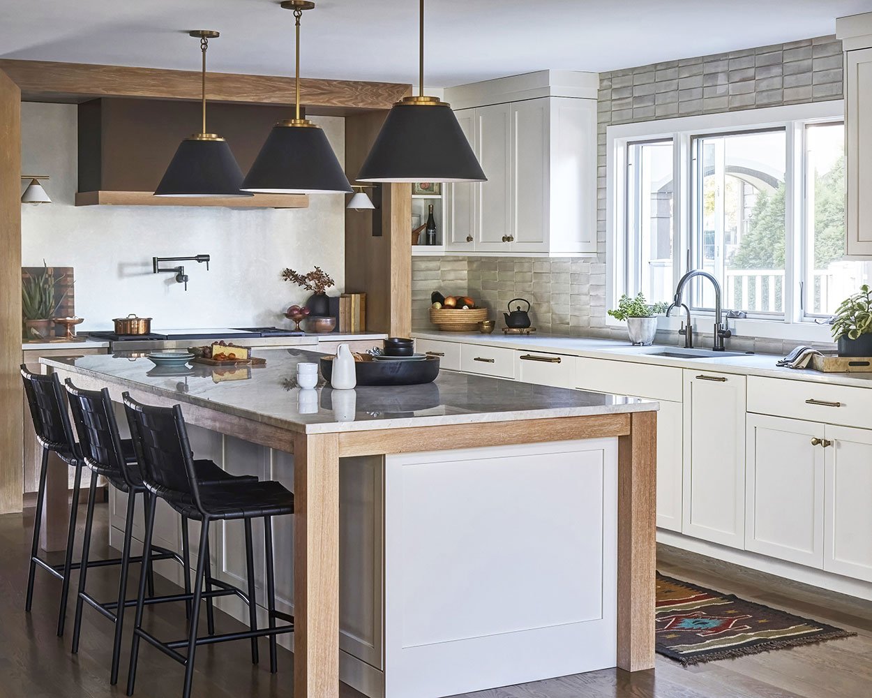
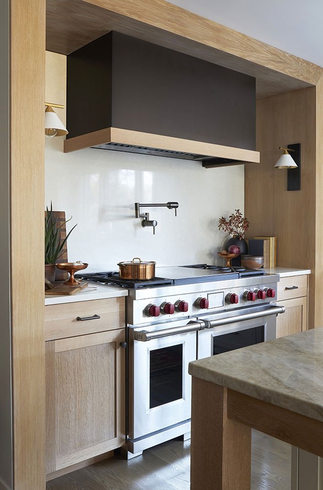
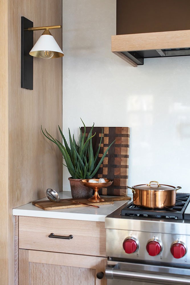
New white oak floors throughout bring instant freshness and kitchen cabinets in a mix of warm white and a weathered, washed oak are a nice play of stain and paint. We used the white oak to wrap casings and the hood elevation - adding some architectural gravitas. The warm metal wrap on the range hood grounds the space and creates a beautiful focal point. Of course, the custom cabinetry is packed with organizational inserts and clever storage - all based on how the chefs of the family cook and use the space.
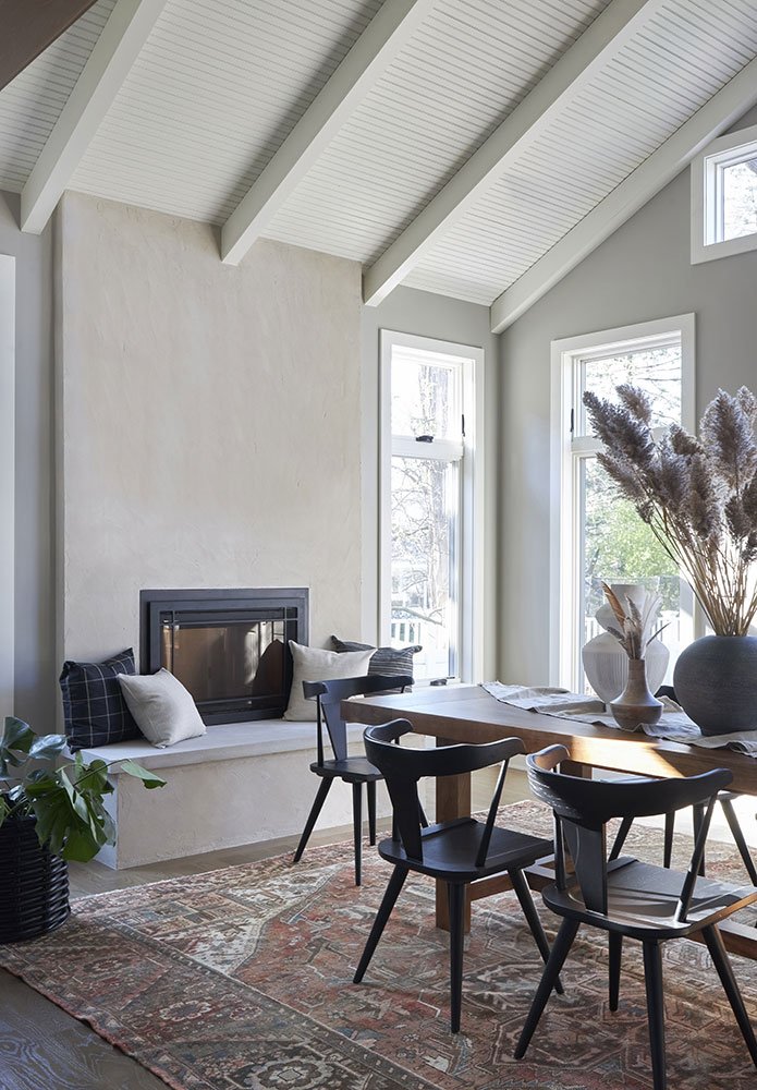
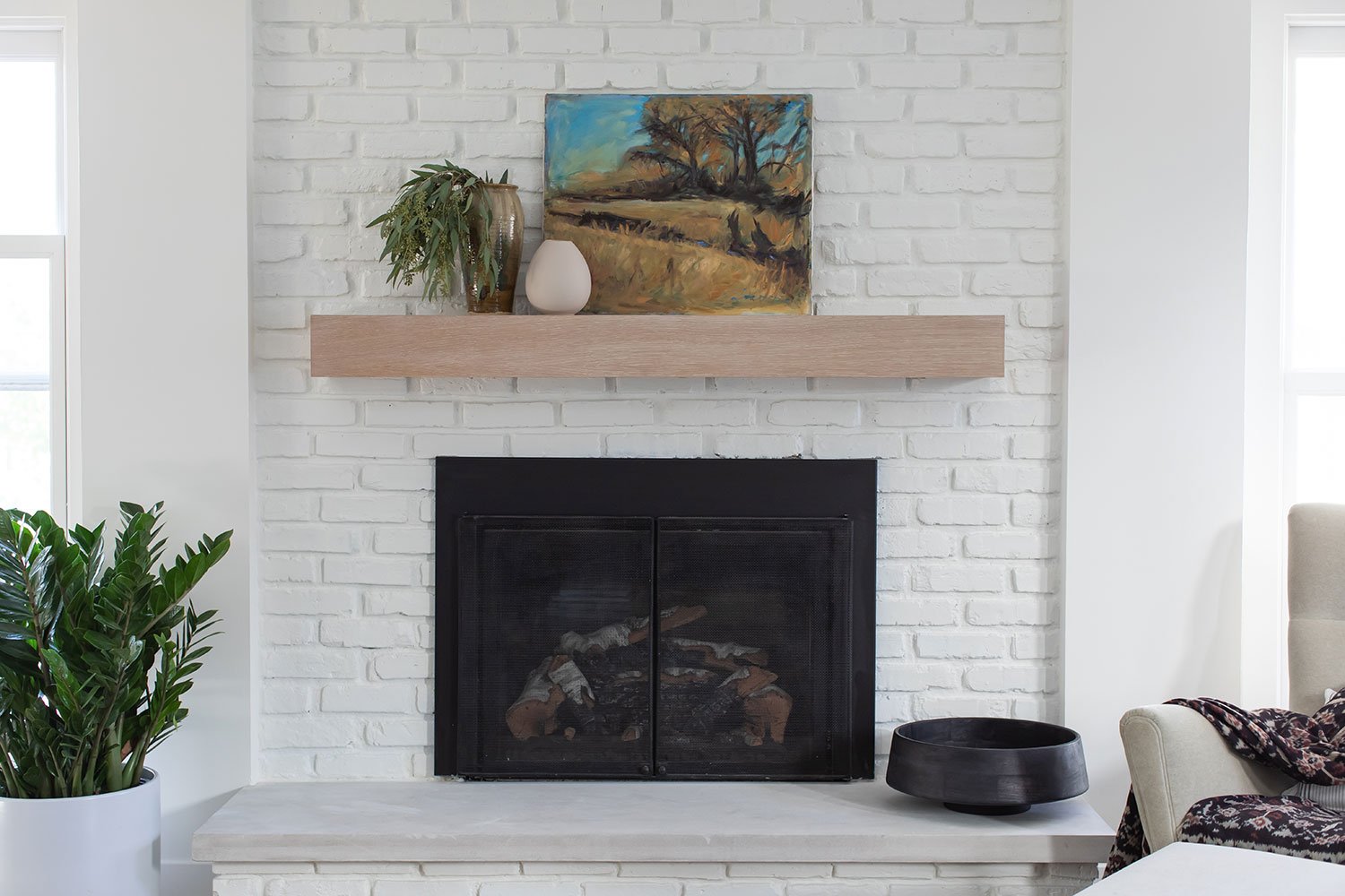
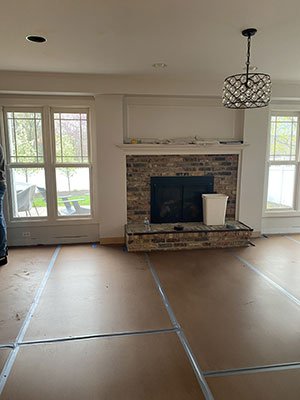
The two original fireplaces were freshened up - one with a stunning plaster application that is at once totally simple and also dramatic. The brick fireplace was whitewashed and given a new white oak mantel.
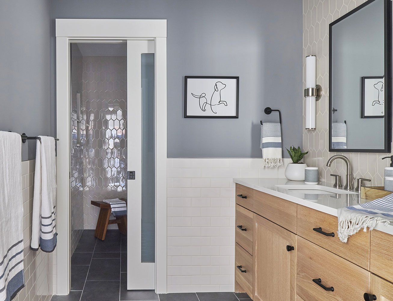
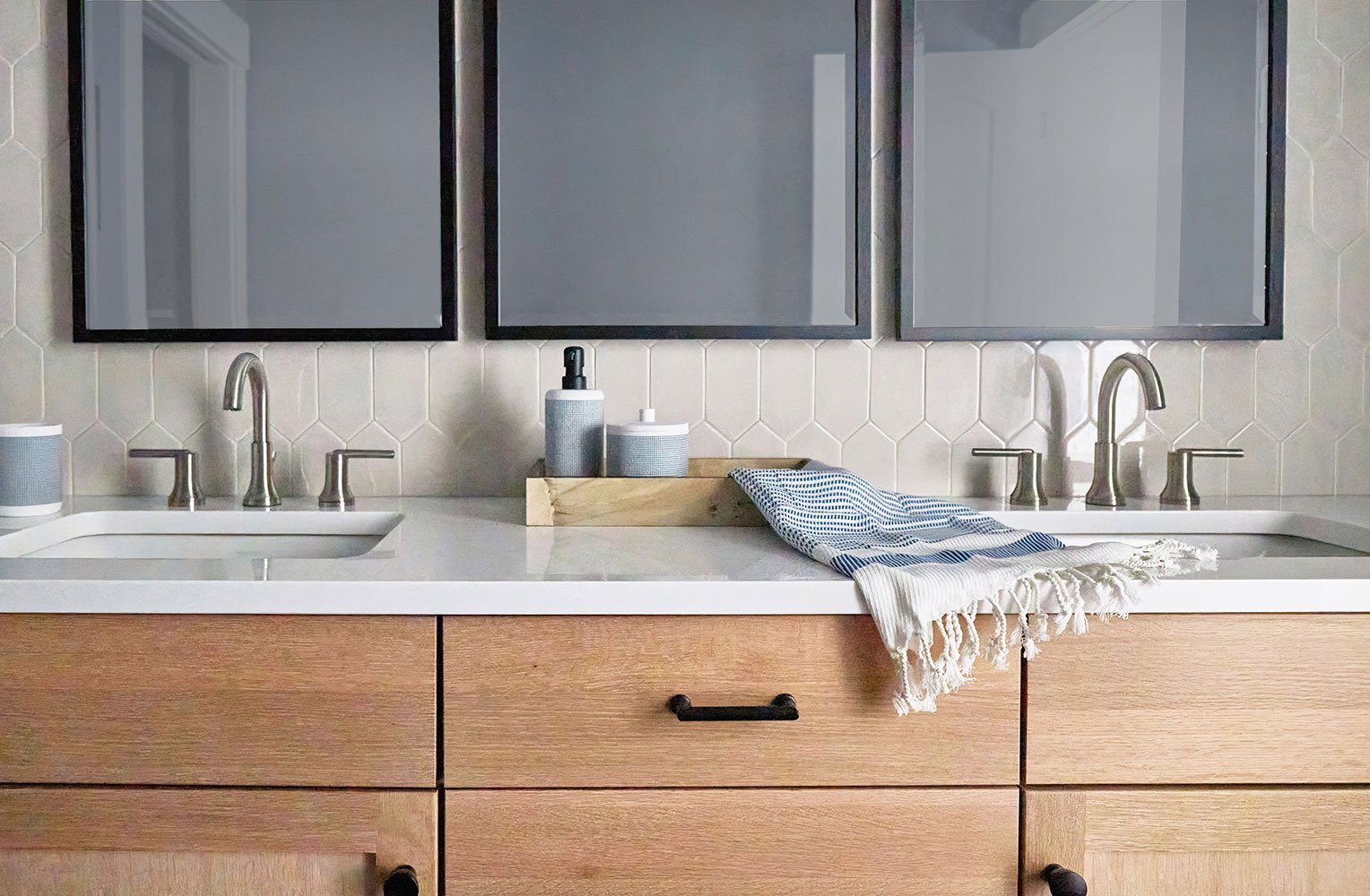
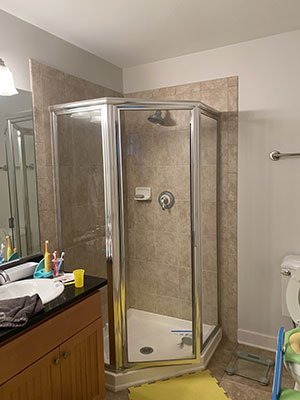
Upstairs, the priority was getting the family bath up to speed for all the folks using it - both kiddos and grandma alike. The addition of a pocket door to separate the shower and toilet from the vanity space instantly increases the efficiency of the space. A curbless shower increases accessibility and the tile package keeps things interesting, yet light and bright. The white oak vanity is packed with storage, along with the commercial grade medicine cabinets. The end result is a highly functional space that manages to feel sophisticated but casual enough for the whole gang.
The transformation of this home was nothing short of remarkable. What was once a dated collection of small rooms and cut-off spaces is now a warm and open kitchen and dining room full of architectural detail and quiet beauty. With its improved layout, there is now space for the entire family to gather in the kitchen for both cooking and hanging out - a renovation well worth the effort.
